Hi! It's us! (Wish it was like Potter, and we could wave to you. Use your imagination.)

Awww, it's the kids. Lily and Furface Smith. Cute little devils aren't they? And no, we did not pose them. They're best buds.

Just to refresh your memory, this is our home. The whole reason I started this thing in the first place. We took this an hour before we closed. I got butterflies seeing that sale pending sign.

And this is our beautiful, albeit overgrown, backyard. I know people. They will come fix this mess in the spring. They know who they are, and they will remember that they offered. I have been told that we have some really nice (read: expensive) trees/plants/living things back there. I solemnly swear to not kill anything, at least not on purpose.

Welcome to our living room. This is the view from the front hall. The art isn't hung yet. I have asked. Many times. I'm patient. The couch and chair are from my old apartment and just so happen to work very nicely in this room. My plan is to add another chair or two soon, and get a new rug. I'm loving the brown and cream zebra print rug from PB. Is zebra over? Do I care?


View of the staircase from the living room.

Our front entry and hall. I need a new light fixture here, but I am perplexed at my options. Flush mount, semi-flush mount, chandelier, period piece, non-period piece...suggestions are welcome.

View of the RED dining room from the front hall. It is small. Yet totally charming. I am not loving the furniture in here, but we bought it less than a year ago so it stays. This is where Chandy is going to live when she gets here next week. She'll be so happy here :)

View from kitchen.

This was one of my favorite features about this old house--the built in. We believe the house has had many layouts, and its past incarnation places the dining room where the kitchen is now. We think. Tim got the history of the house from a neighbor. That is a story for another time. I know you just want to see pictures.

I apologize for my messy and dark kitchen. I do love this space though. For the age and size of the house (smallish), this is a huge kitchen. I have more cabinet space than I can fill up, and it's in good condition. We will be replacing the counters and flooring next year, hopefully, and getting new appliances. No, there is nothing wrong with them. Tim is an appliance snob, and they must match.

The butcher block island is another of my favorite things. And we have some great open shelving.

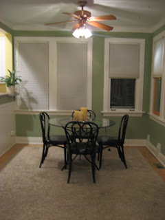
View from breakfast nook/sun room/random room I don't know what to do with. The yellow is on its way out. I am taking suggestions for wall color. To stay for now: white cabs, faux beige/gray granite counters, gray/white check linoleum (ack!).

This only represents half of this room. I think the other half will become a TV room...I'll get a small couch and chair. This room is also going to be painted. Since it opens right off the kitchen, I am thinking keeping it in the same tone, but maybe a shade darker. It gets an amazing amount of light from the southern exposure. Look! Those chairs??? Authentic Thonet bentwood chairs. . .courtesy of Craigslist. I am so proud.

And now we have the downstairs full bath. The previous owners did a wonderful job with this bathroom. They maintained the period feel of the home while allowing it to be fully functional and updated. It makes me smile everytime.


Did someone have a little girl? I think so! Bye bye pink. Next weekend. This is the room I am having trouble with. The bedding is staying, so I need to work around that. I am leaning towards a pale pale aqua. Suggestions? Also, I skipped a photo of the third bedroom/former nursery because it is a mess. I have standards, and it is not living up to them.

Our bedroom. The wall color-it is a bit guacamole-ish eh? Again, I am open to suggestions. I change the bedding twice a year based on the season so it has to be neutral enough to match the existing bedding and whatever I get for next year.


I am ashamed to show you all this. We need a dresser. Like yesterday. And if you look closely you'll see my shoes behind the door in the alcove. Three shoe racks full of shoes. My heart hurts that they don't have a good home right now. Also, isn't that TV FAR TOO BIG for the room? I mean, seriously? Tim insists it stays, I think otherwise. Your comments and votes may be enough to sway him.
So there you have it. Our wonderful, beautiful, gorgeous, most perfect home. Or soon to be perfect home. I have so many plans for it. It makes me giddy thinking about all the memories we will create in this home. Thank you, Tim, for making this all possible, and for making me the happiest girl in the world. Minus the gigantor TV in the bedroom. Kisses!
Edited to add: Mission accomplished. New TV in the bedroom, much smaller in size. It was ALL Tim's idea. Great job, honey! Way to go!


2 comments:
"Minus the gigantor TV in the bedroom" - hmmm - votes from others to get me to change my mind? Remember the Bush/Gore election? yeah - votes really don't matter.
Sara-- don't let Chris see your bedroom tv, he will get very, very jealous. And then side with Tim.
Post a Comment